A successful customer experience management (CEM) program requires the collection, synthesis, analysis and dissemination of customer metrics. Customer metrics are numerical scores or indices that summarize customer feedback results for a given customer group or segment. Customer metrics are typically calculated using customer ratings of survey questions. I recently wrote about how you can evaluate the quality of your customer metrics and listed four questions you need to ask, including how the customer metric is calculated. There needs to be a clear, logical method of how the metric is calculated, including all items (if there are multiple items) and how they are combined.
Calculating Likelihood to Recommend Customer Metric
Let’s say that we conducted a survey asking customers the following question: “How likely are you recommend COMPANY ABC to your friends/colleagues?” Using a rating scale from 0 (not at all likely) to 10 (extremely likely), customers are asked to provide their loyalty rating. How should you calculate a metric to summarize the responses? What approach gives you the most information about the responses?
There are different ways to summarize these responses to arrive at a customer metric. Four common ways to calculate a metric are:
- Mean Score: This is the arithmetic average of the set of responses. The mean is calculated by summing all responses and dividing by the number of responses. Possible scores can range from 0 to 10.
- Top Box Score: The top box score represents the percentage of respondents who gave the best responses (either a 9 and 10 on a 0-10 scale). Possible percentage scores can range from 0 to 100.
- Bottom Box Score: The bottom box score represents the percentage of respondents who gave the worst responses (0 through 6 on a 0-10 scale). Possible percentage scores can range from 0 to 100.
- Net Score: The net score represents the difference between the Top Box Score and the Bottom Box Score. Net scores can range from -100 to 100. While the net score was made popular by the Net Promoter Score camp, others have used a net score to calculate a metric (please see Net Value Score.) While the details might be different, net scores take the same general approach in their calculations (percent of good responses – percent of bad responses). For the remainder, I will focus on the Net Promoter Score methodology.
Comparing the Customer Metrics
To study these four different ways to summarize the “Likelihood to recommend” question, I wanted to examine how these metrics varied over different companies/brands. Toward that end, I re-used some prior research data by combining responses across three data sets. Each data set is from an independent study about consumer attitudes toward either their PC Manufacturer or Wireless Service Provider. Here are the specifics for each study:
- PC manufacturer: Survey of 1058 general US consumers in Aug 2007 about their PC manufacturer. All respondents for this study were interviewed to ensure they met the correct profiling criteria, and were rewarded with an incentive for filling out the survey. Respondents were ages 18 and older. GMI (Global Market Insite, Inc., www.gmi-mr.com) provided the respondent panels and the online data collection methodology.
- Wireless service provider: Survey of 994 US general consumers in June 2007 about their wireless provider. All respondents were from a panel of General Consumers in the United States ages 18 and older. The potential respondents were selected from a general panel which is recruited in a double opt-in process; all respondents were interviewed to ensure they meet correct profiling criteria. Respondents were given an incentive on a per-survey basis. GMI (Global Market Insite, Inc., www.gmi-mr.com) provided the respondent panels and the online data collection methodology.
- Wireless service providers: Survey of 5686 worldwide consumers from Spring 2010 about their wireless provider. All respondents for this study were rewarded with an incentive for filling out the survey. Respondents were ages 18 or older. Mob4Hire (www.mob4hire.com) provided the respondent panels and the online data collection methodology.
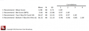
Table 1. Correlations among different summary metrics of the same question (likelihood to recommend).
From these three studies across nearly 8000 respondents, I was able to calculate the four customer metrics for 48 different brands/companies. Companies that had 30 or more responses were used for the analyses. Of the 48 different brands, most were from the Wireless Service provider industry (N = 41). The remaining seven were from the PC industry. Each of these 48 brands had four different metrics calculated on the “Recommend” question. The descriptive statistics of the four metrics and the correlations across the 48 brands appear in Table 1.

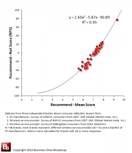
Figure 1. Scatterplot of two ways to summarize the “Likelihood to Recommend” question (Mean Score and Net Score (NPS)) for the Recommend Question
As you can see in Table 1, the four different customer metrics are highly related to each other. The correlations among the metrics vary from .85 to .97 (the negative correlations with Bottom 7 Box indicate that the bottom box score is a measure of badness; higher scores indicate more negative customer responses).
These extremely high correlations tell us that these four metrics tell us roughly the same thing about the 48 brands. That is, brands with high Mean Scores are those that are getting high Net Scores, high Top Box Scores and Low Bottom Box scores. These are overly redundant metrics.
When you plot the relationship between the Mean Scores and Net Scores, you can clearly see the close relationship between the two metrics (see Figure 1.). In fact, the relationship between the Mean Score and NPS is so high, that you can, with great accuracy, predict your NPS score (y) from your Mean Score (x) using the regression equation in Figure 1.
Mean Score vs Net Promoter Score vs Top/Bottom Box
The “Likelihood to Recommend” question is a commonly used question in customer surveys. I use it as part of a larger set of customer loyalty questions. What is the most efficient way to summarize the results? Based on the analyses, here are some conclusions regarding the different methods.
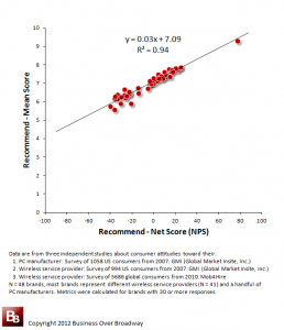
Figure 2. Scatterplot of two ways to summarize the “Likelihood to Recommend” question (Net Score (NPS) and Mean Score) for the Recommend Question
1. NPS does not provide any additional insight beyond what we know by the Mean Score. Recall that the correlation between the Mean Score and the NPS across the 48 brands was .97! Both metrics are telling you the same thing about how the brands are ranked relative to each other. The mean score uses all the data to calculate the metric while the NPS ignores specific customer segments. So, what is the value of the NPS?
2. NPS score is ambiguous/difficult to interpret. An NPS value of 15 could be derived from a different combination of promoters and detractors. For example, one company could arrive at an NPS of 15 with 40% promoters and 25% detractors while another company could arrive at the same NPS score of 15 with 20% promoters and 5% detractors. Are these two companies with the same NPS score really the same?
Also, more importantly, the ambiguity of the NPS lies in the lack of a scale of measurement. While the calculation of the NPS is fairly straightforward (e.g., take the difference of two values to arrive at a score), the score itself becomes meaningless because the difference transformation creates an entirely new scale that ranges from -100% to 100%. So, what does a score of zero (0) indicate? Is that a bad score? Does that mean a majority of your customers would not recommend you?
Understanding what an NPS of zero (0) indicates can only occur when you map the NPS value back to the original scale of measurement (0 to 10 likelihood scale). A scatterplot (and corresponding regression equation) of NPS and Mean Score is presented in Figure 2. If we plug zero (0) into the equation, your expected Mean Score would be 7.1, indicating that a majority of your customers would recommend you (mean score is above the midpoint of the rating scale). If you know your NPS score, you can estimate your mean score using this formula. Even though it is based on a narrowly defined sample, I think the regression model is more a function of the constraints of the calculations than a characteristic of the sample. I think it will provide some good approximation. If you try it, let me know how how accurate it is.
3. Top/Bottom Box provides information about clearly defined customer segments. Segmenting customers based on their survey responses makes good measurement and business sense. Using top box and bottom box methods helps you create customer segments (e.g., disloyal, loyal, very loyal) that have meaningful differences across segments in driving business growth. So, rather than creating a net score from the customer segments (see number 2), you are better off simply reporting the absolute percentages of the customer segments.
Summary
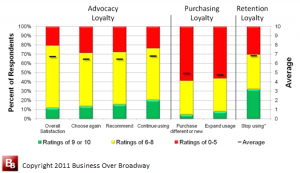
Figure 3. Reporting loyalty results using mean scores and top/middle/bottom box scores (customer segments).
Communicating survey results requires the use of summary metrics. Summary metrics are used to track progress and benchmark against loyalty leaders. There are a variety of ways to calculate summary metrics (e.g., mean score, top box, bottom box, net score), yet the results of my analyses show that these metrics are telling you the same thing. All metrics were highly correlated with each other.
There are clear limitations to the NPS metric. The NPS does not provide any additional insight about customer loyalty beyond what the mean score tells us. The NPS is ambiguous and difficult to interpret. Without a clear unit of measurement for the difference score, the meaning of an NPS score (say, 24) is unclear. The components of the NPS, however, are useful to know.
I typically report survey results using mean scores and top/middle/bottom box results. I find that combining these methods help paint a comprehensive picture of customer loyalty. Figure 3 includes a graph that summarizes the results of responses across three different types of customer loyalty. I never report Net Scores as they do not provide any additional insight beyond the mean score or the customer segment scores.



 Beyond the Ultimate Question
 Measuring Customer Satisfaction and Loyalty (3rd Ed.)
I note that there is an extreme outlier case in each of the regression charts. This single data point will have an excessively large influence on the regression analyses. The outlier case should be removed and regression analyses rerun.
I made a summary in French of your article in my blog.
You can see it here. http://blog.init-marketing.fr/2013/10/le-meilleur-indicateur-de-la.html#more
Thank you for your great article!