This blog post is part of a series to help people learn the basic concepts of statistics. See the overview, Making Sense of Our Big Data World: Statistics for the 99%, to understand the importance and value of understanding statistics and statistical thinking.
Data can be overwhelming. Often we are confronted with large data sets consisting of hundreds, thousands or millions of scores. Summarizing the data helps us make sense of it. This blog post will discuss one way of summarizing large data sets with the use of frequencies and histograms.
Frequencies
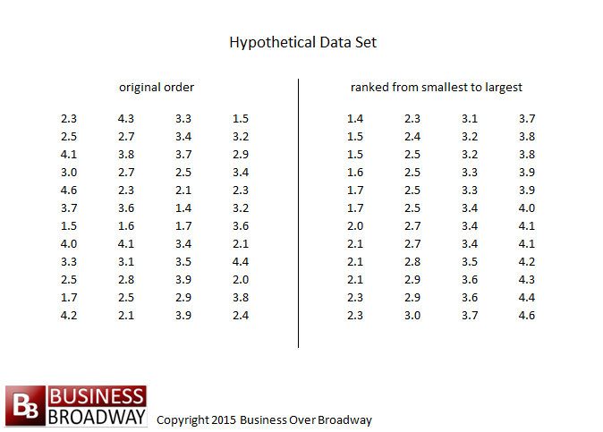
Table 1 lists scores from a hypothetical study examining the level of customer satisfaction of a given company. The data set contains 48 scores, each representing one person’s average score on the customer satisfaction questionnaire. Upon examination, we see that scores vary somewhat, ranging from a low of 1.4 to a high of 4.6. To gain a better understanding of the data, we need to summarize the scores in a simple format.
One way of summarizing data is to calculate the frequency of occurrence of a specific value, or how often that given value occurs in our data set. To calculate frequencies, we first rank the scores from lowest to highest (see right half of Table 1). After the ranking, we determine the frequency of occurrence of each value. We see that the value of 1.4 occurred only once. Therefore, 1.4 has a frequency of one. Likewise, the value of 2.5 has a frequency of four.
Although calculating frequencies for each specific value will help summarize the information, the amount of information can still be overwhelming. For example, with characteristics measured in small increments, we may obtain a lot of values, each occurring with little frequency. Calculating the frequency of each value might not be enough to simplify the data. Therefore, when calculating frequencies, we usually group values with similar scores into a particular class. Then we calculate frequencies for these class values.
Class Intervals
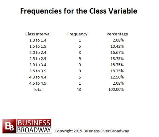
A class interval represents a range in which a set of values is included. Creating class intervals is a process of dividing the scores into specified equal intervals. Each class interval is defined by a lower bound and an upper bound. The lower bound represents the lowest possible score that can be included in the interval; the upper bound represents the highest possible score. Using the data set in Table 1, we can create a class interval with the width of 0.4 to represent the scores. Starting with a lower bound of 1.0, the first class interval would include scores ranging from a low of 1.0 to a high of 1.4. The second class interval would include scores ranging from 1.5 to 1.9. The last class interval would include scores ranging from 4.5 to 4.9. Table 2 presents these class intervals and the frequency of values that occur in the class.
We use arbitrary numbers to select class intervals and determine the width of each class interval. It has been shown that, if continuous data are divided into intervals, you lose less information about the data by creating more intervals. A reasonable number of intervals is seven (Shaw, Huffman, and Haviland 1987¹), although more intervals would result in less information loss.
Percentages
Another way of looking at the frequency of values is through the use of percentages. A percentage reflects the proportion of scores of a particular value. The percentage for a particular value is calculated by dividing the frequency of a given value by the total number of scores in the data set. For our data, we see that the percentage of people with scores of 2.5 to 2.9 is 18.8 percent (9/48), and the percentage of people with scores ranging from 4.0 to 4.9 is 14.6 percent (7/48). The total of the percentages for a given question should be 100 percent (given rounding errors).
The percentage is sometimes preferred to the frequency since it incorporates the total number of scores into its calculation. A frequency of 50 may not tell us all we want to know about the data. A frequency of 50 in one sample of scores may indicate a large percentage (for example, when sample size is 60), while in another sample a frequency of 50 may indicate a minute percentage (for example, when sample size is 1,000,000). Thus, before interpreting the magnitude of the frequency, we should be aware of the total sample size.
Constructing Frequency Distributions of the Intervals
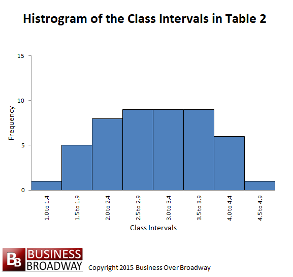
We can graphically represent the frequencies of the class intervals. The graph is formally called a histogram. The histogram aids in summarizing the data beyond the lone use of frequencies since it captures many pieces of information in a single picture. The histogram not only indicates the frequency of each value, but also roughly indicates the range of the data (lowest to highest value) and the shape of the distribution.
The histogram has two axes. The horizontal axis (sometimes referred to as the X axis or abscissa) represents the variable or class interval. The vertical axis (sometimes referred to as the Y axis or ordinate) represents the frequency for a variable or class interval.
The horizontal axis is scaled by the midpoint of each class interval. Therefore, for the data in Table 2, the horizontal axis would be scaled by eight values, each value representing the midpoint of each class interval. The midpoints are 1.2, 1.7, 2.2, 2.7, 3.2, 3.7,4.2, and 4.7. The histogram appears in Figure 1.
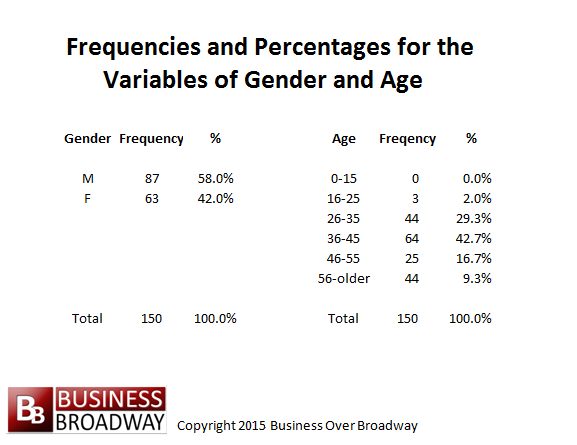
We can calculate frequencies for variables that are on any scale of measurement (nominal, ordinal, interval, and ratio). For example, a questionnaire could include various questions pertaining to satisfaction levels as well as questions asking for demographic information. The demographic portion could include questions pertaining to gender and age.
If the questionnaire was distributed to 150 people, we could subsequently calculate the frequency or proportion of males versus females and also determine the frequency or proportion of a given age group. The frequencies for the sex variable (nominal) and age variables (ratio) are listed in Table 3. The frequencies indicate that the sample consists of more males than females. In terms of percentages, we see that males represent 58 percent (87/150) of respondents and females represent 42 percent of respondents. Also, this sample consists of a large group of people aged 36 to 45 years.
Distributions
The histogram in Figure D.1 can also be called a distribution of scores. Although there are many forms of distributions, such as a bi-modal (two-humped) distribution and a uni-modal (one-humped) distribution, I will present a special type called a normal distribution. The normal distribution is a symmetric, bell-shaped distribution. Many of the things we measure in our environment can be described by a symmetric, bell-shaped distribution. For example, if the heights of many people were plotted, the shape of the histogram would form a normal distribution.
Example
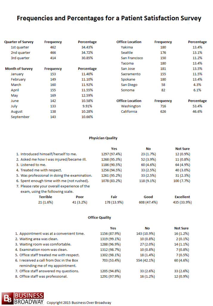
A clinic conducted a patient survey to better understand their patient’s level of satisfaction. The survey questions as well as the percentage respondents for each of the questions are presented in Table 4.
As we can see in Table 4, the distribution of scores is fairly evenly spread across the three quarters of the year. Additionally, the surveys are composed of surveys from all of the offices in the western region. Most of the surveys represent the San Jose, Yakima, Tacoma, and Spokane offices. San Diego and Sonoma have the least amount of surveys. Furthermore, a little over half of the sample of surveys (53.4 percent) is from offices located in the state of Washington. Looking at the percentage of responses for our survey questions, many of the customers indicate a “Yes” to the questions. The percent of “Yes” responses range from a low of 53.4 percent to a high of 99.1 percent.
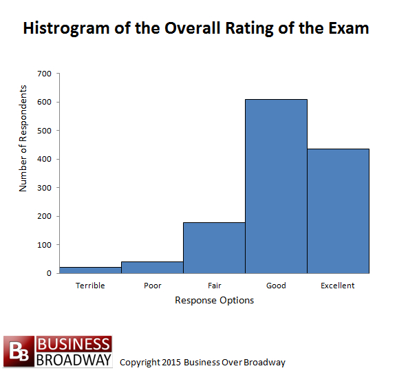
Figure 2 shows a histogram of the responses for the overall rating of the exam. As is indicated, most of the respondents rated the exam “Good” or “Excellent” response.
Summary
I introduced various ways of describing and presenting data. Frequency tables and the histograms are both useful tools for summarizing data. The frequency table reflects the frequency of occurrence of specific values or the frequency of values for a specific class interval. The histogram is a graphic illustration of the frequency table.
¹ Shaw, D.G., Huffman, M.D. and Haviland, M.G. (1987). Grouping continuous data in discrete intervals: information loss and recovery. Journal of Educational Measurement, 20(2), 167-173.



 Beyond the Ultimate Question
 Measuring Customer Satisfaction and Loyalty (3rd Ed.)
[…] Frequencies, Percentages, Histograms and Distributions […]